
SEcuregrid - website re-design
Helping Visitors Find the Right Security Solution
I redesigned Securegrid’s website to simplify product discovery, connect industry needs with relevant solutions, and guide visitors from exploration to enquiry.
4 mins read
Product
B2B Enterprise Cybersecurity Corporate Website
Role
Responsible for UX Strategy · IA · Interaction Design · Visual Design
Method
Competitive analysis · persona · IA · journey mapping · sitemap

Securegrid’s cybersecurity website needed a clearer way to present its 11 products and help enterprise buyers find relevant solutions. I redesigned the navigation, information architecture, and page layouts to connect buyer needs with product capabilities and create a consistent journey from discovery to enquiry.
THE REAL PROBLEM
Where the User Journey Breaks Down
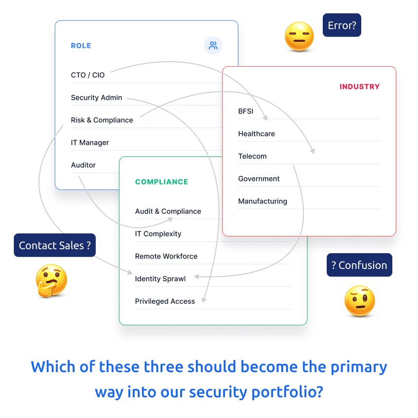
Securegrid’s website relied heavily on product categories and technical terminology, making relevant solutions difficult to find. A security leader exploring compliance needed a direct path from the business challenge to the right product. The challenge was to align product discovery with how enterprise buyers search for solutions.
THE SOLUTION
Navigation Built Around Buyer Needs
I restructured the navigation around how visitors look for security solutions. By separating Products, Solutions, and Services, I created clear paths to explore capabilities, address business challenges, and find relevant services. This shifted the experience from Securegrid’s internal product structure to a discovery journey shaped around visitor needs.

Defining the Persona
Understanding the Audience
Enterprise security leaders, IT teams, and compliance professionals approach cybersecurity with different priorities. Some focus on reducing risk, while others evaluate product capabilities and compliance requirements. Understanding these needs helped me shape the content hierarchy and create clearer paths to relevant information.

INVESTIGATION
Looking Beyond the Existing Website
I reviewed cybersecurity and enterprise websites to compare navigation, product discovery, and industry-specific pathways. This competitive analysis helped identify opportunities to improve information hierarchy, reduce cognitive load, and communicate product value more clearly.

Commercial Audit
7 VENDORS · 8 DIMENSIONS
Evaluated 7 vendors across 8 dimensions to understand how they balance broad capabilities with user clarity.

Pattern Research
SRTRIPE, HASHICORP
Analysed industry giants to understand alternative navigation and product-discovery patterns.

Audience Mapping
6 TARGETED PERSONAS
Interviewed internal engineers and external buyers to map distinct workflows.
Key insights
Make product discovery more flexible so visitors can explore based on their needs.
Explain business value before technical details and use consistent patterns across pages.
Help visitors understand why a solution matters before asking them to explore its features.
SITEMAP + USER JOURNEY MAP + IA
Defining How Visitors Find Their Way
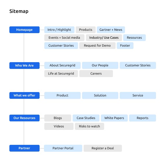
I mapped the journey from discovery to enquiry, defining the role of each page. The homepage introduces Securegrid, product pages explain capabilities, and industry pages connect solutions to real-world needs. This systems thinking connected individual touchpoints into one continuous user journey.


I translated the user journey into a sitemap, organising company information, offerings, resources, and partner content into clear sections. I defined the information hierarchy and reusable page structure around clarity and consistency, connecting related content and supporting future growth.

MID-fidelity WIREFRAMES
Testing the Structure Before the Visuals
With the structure in place, I explored how information should flow across pages. The wireframes focused on layout, content hierarchy, navigation, and calls to action. This interaction design work established clear page patterns and helped address potential navigation friction before detailed UI design.

design decisions
Designing a Connected Website Experience
I designed five core experiences—navigation, homepage, product, industry, and contact—to help visitors move from discovering Securegrid to evaluating solutions and making enquiries. Each page serves a distinct user need, while reusable components and consistent layouts create a unified experience across all 11 products.
11 PRODUCTS
One Consistent Experience
Easy to navigate
Easy to maintain
Easy to scale
Navigation: I grouped content into clear categories to reduce complexity and help visitors move from exploration to action.

Home Page: I prioritised value, credibility, and multiple discovery paths to help visitors find relevant solutions across 11 products.

Product Page: I structured content from value to features, use cases, and compliance to help buyers evaluate product suitability.

Industry Page: I led with industry challenges and mapped them to relevant solutions to make product discovery more contextual. Get in Touch: I simplified enquiries and organised regional contacts to help visitors reach the right sales team.

VISUAL SYSTEM
Building a Consistent Visual Language
Once the page structures were defined, I established a design system using Securegrid’s brand colours, typography, spacing, and reusable components. Design tokens and shared patterns kept information clear and visual elements consistent across different page types, supporting a unified experience as the website scaled across 11 products.

FINAL EXPERIENCE
The Solution in Action
The final designs connect navigation, page structure, and visual patterns to solve Securegrid’s core challenge: making 11 products easier to discover and evaluate. From product, industry, use case, and compliance pages to Library, Partner, and Get in Touch, each page supports the journey from exploration to enquiry. Responsive layouts and consistent patterns create a unified experience across screens.


The result
The redesign established clearer navigation, reusable page templates, and a consistent visual system across Securegrid’s 11 products. It created a scalable foundation for easier content maintenance and future growth. The designs were approved and handed over for development; measurable user impact will need to be validated after launch.
What i learned
This project reinforced that effective information architecture starts with how users search for solutions, not how a company categorises its products. By connecting user needs, business goals, and reusable design patterns, I learned to create a cohesive experience while allowing each page to serve a distinct purpose.
Explore my other case studies

Mobile & web application
Designing a Centralized MFA Experience for Keyzen
I designed Keyzen Auth to provide a centralized multi-factor authentication experience across Keyzen’s products, connecting device enrollment, sign-in verification, and secure device recovery into one seamless user journey.
Read Case Study

website design
Making Custom Handcrafted Shoes Accessible Through E-commerce
I created custom footwear e-commerce experience for Firstcraft, combining UX strategy, product customization, and interaction design to simplify shoe personalization and make handcrafted footwear more accessible through an intuitive buying journey.
Read Case Study